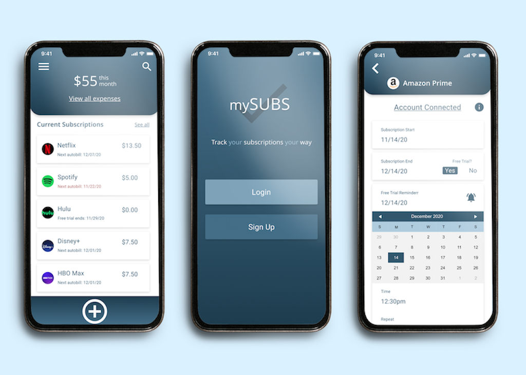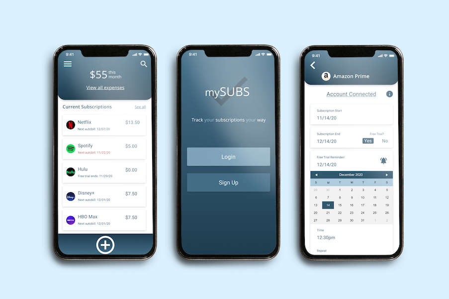
mySUBS screens
mySUBS is a subscription tracker app, which aims to make users more aware of their expenses, more organized, and help them potentially save money on their subscriptions.
The app was designed in a process of needfinding research, creating UX personas, stories, and views, designing wireframes, and going through two rounds of prototypes.
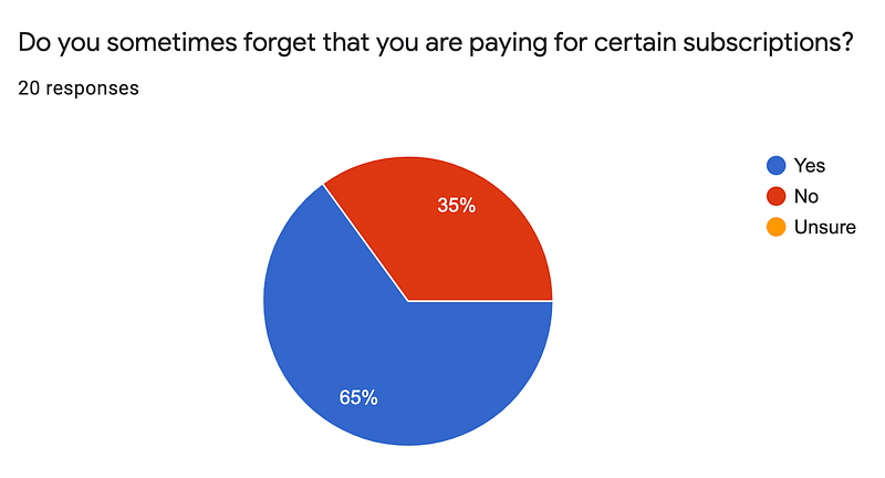
Needfinding research was conducted through a 13 question google form and had 20 responses from participants who were currently using and/or paying for some
kind of subscription. In this form, the majority of participants said that they sometimes forget they are paying for certain subscriptions and don’t have a method of tracking them.
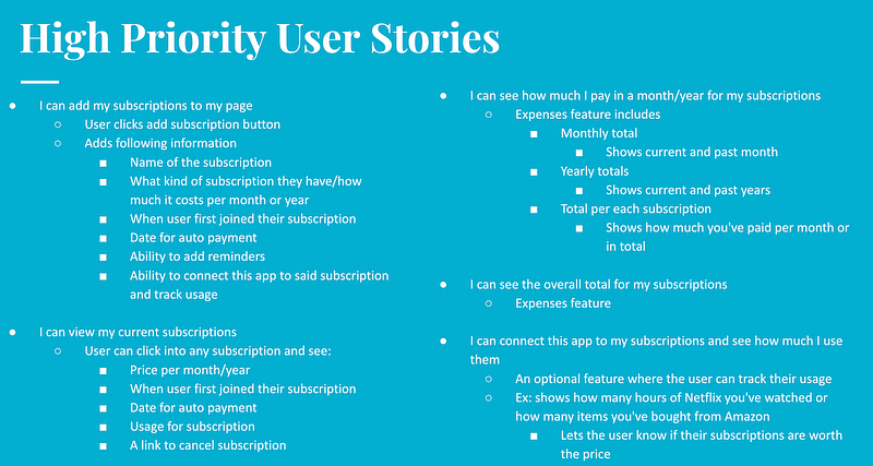
I then created two UX personas for tech savvy and non tech savvy users that want to track their subscriptions. From there I created user stories such as adding and viewing
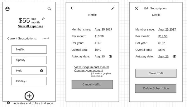
current subscriptions and viewing the monthly and yearly total for each subscription or all subscriptions. Wireframes were designed next with the home screen of the app
showing how much the user is currently paying while also giving a rundown of their most recent subscriptions.

Google form question and responses

User stories examples

Wireframe mockup of mySUBS app showing the home screen, the format for each individual subscription, and how to edit the information
My first prototype focused on the color scheme and built on the layout I had created in my wireframes. I also made sure to clearly show how to add
or edit a subscription and what information can be added into the app. Search bars were also added to make app navigation easier for any user. My primary focus with
the first prototype was to show how a subscription can be tracked and how it would appear in the app.
After receiving feedback from prototype 1, I designed prototype 2 and made changes, for example, I added more pop ups for “connect you account” and “cancel Netflix
subscription” to make the process clearer and to let the user know what they can accomplish through the app. I also added the subscription icons, which makes the
home page look better and makes it even easier to understand. I also built out the profile page, made the yearly and monthly expenses screens show more data, created
confirmation screens, and corrected all the prototype links.
Overall mySUBS would be a very beneficial app and help users to save money on their subscriptions. Seeing one’s subscription expenses per month all in one place
is very eye opening, so maybe it would eventually save the user money!
Interact with the prototype below to explore the app.
mySUBS XD Prototype
